Hot Tomatoes
published May 2026
see it live (password: demo)Brand Strategy
UI Design
Figma
Shopify
Liquid
HTML/CSS
JavaScript
Scroll Animation
Hot Tomatoes is a fictional brand I created to demonstrate brand thinking, ecommerce design, and frontend development. What's covered: brand positioning and voice, a color and typography system, a product naming system, Shopify theme customization (Crave), custom Liquid sections, a scrolling animation built in JavaScript, and considerations for accessibility and mobile compatibility.
To view the live site, visit Hot Tomatoes and enter the password: "demo".
The Brand Premise
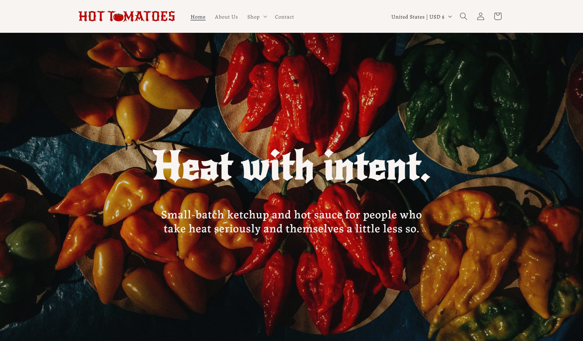
As a category, spicy ketchups and hot sauces lean hard on the cliché of skull imagery and "DEATH SAUCE XXX", or trendy minimalism with names like "Fermented Chili Spread No. 3". In developing the brand for Hot Tomatoes, I wanted it to feel like a balance between the two, like using theatrical names within a modern color palette.
"Heat with intent" is the brand's tagline, keeping the classic "spice first" attitude while highlighting the intentionality of each sauce. Product descriptions and other copy was written in a straight-to-the-point voice, with a few puns here-and-there to keep it from getting too heavy.
Visual Brand Identity
Typography
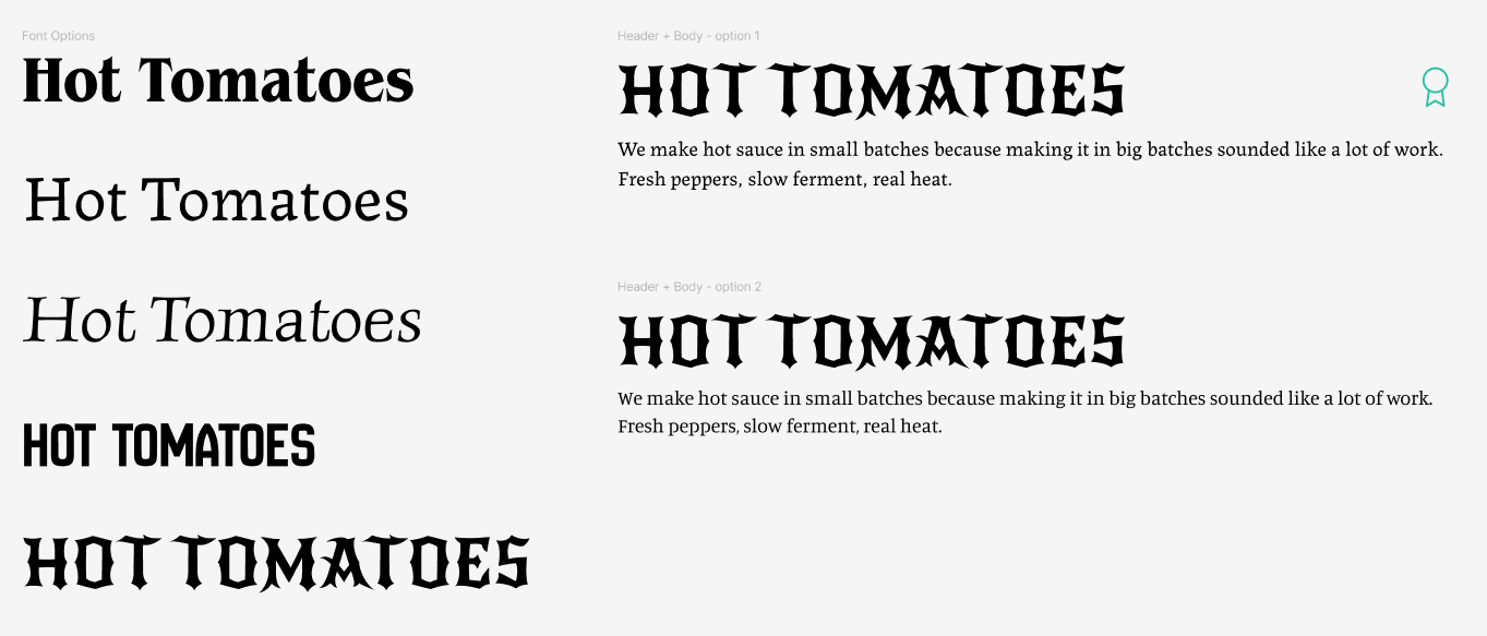
Fonts say a lot about a brand, so choosing the right header & body fonts is a crucial task. I always start by typing out the brand name and cycling through Google Fonts; every time I see one I like, I select it, make a copy, and keep going down the list. After my initial pass through, I had 5 favorites, but the Google Font New Rocker really stood out to me. It felt like a modern take on what could be a classic hot sauce brand font.
During my scan, I had also come across two contenders for body fonts. I felt drawn to a serif style that felt classic yet offset the heaviness of the header font, and compared Labrada and Manuale. In the end, Labrada won due to its character and slight un-polish, which felt perfect for a food brand.
Colors, Logo, Bottle Design: First Pass
Oops - I hate it.
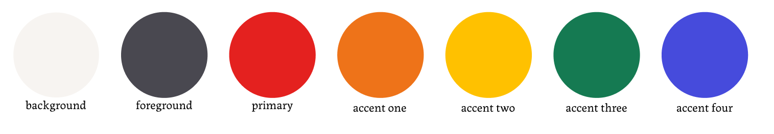
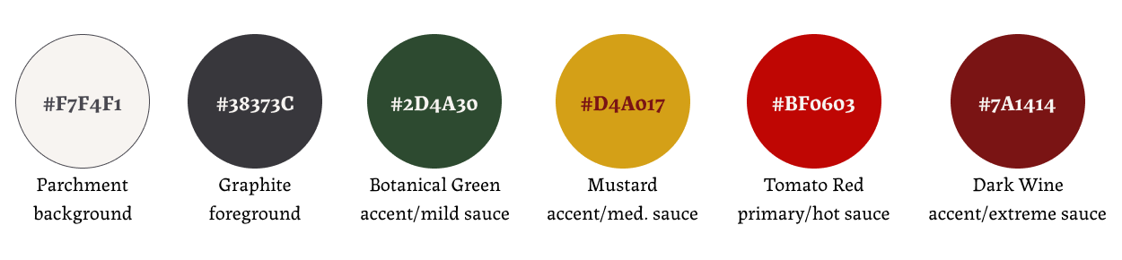
To start, I selected my background (Parchment, #F7F4F1) and foreground colors (Charcoal, #494850), which contrast nicely for readability without being too harsh on the eyes. I knew that I wanted a red color for the tomato, then added a yellow to match the classic "fast food" red & yellow combination. (My first mistake). I also pulled inspiration from the Tabasco hot sauce branding and decided to add a green.
Feeling a bit unsure of how to use red + yellow + green without looking like a stoplight manufacturer, I decided to lean on the concept of per-sauce accent colors: orange, yellow, green, and blue, each tied to a specific sauce flavor. The idea was that each product would have its own visual identity, but in practice, it just looked scattered. The blue & green especially felt out-of-place, since everything else in the palette was warm, and they fought hard against it.
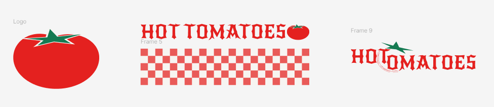
I also got too excited about adding a pattern into the mix, and attempted this checker print as a brand texture. Ultimately, it ended up looking like an Italian pizzeria vibe, which didn't match what I was going for.
The bottle mockups at this stage were also pretty lazy: I wasn't feeling inspired by the color palette, and therefore didn't feel like attempting to make any mockup. I thought using the Comic Sans font and going with an "I'm not a label designer" message would be funny and self-aware, but it failed miserably.
I also floundered around with the logo design quite a bit (which is to be expected). Do I just use a tomato as the logo? Do I incorporate the checkered pattern somehow? Is there a way to combine "hot" and "tomato" into some revolutionary graphic? For me, the answer was no.
Colors, Logo, Bottle Design - Second Pass
That's more like it!
The second pass started with a question I should've asked myself the first time: what is the color system actually doing? Per-sauce accents weren't communicating anything structural, just decoration. It also felt too cluttered having one accent color per hot sauce, which left me wondering when I would use the primary red without it being too busy.
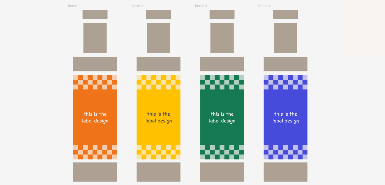
Therefore, I scrapped my previous approach, simplified and elevated the color scheme, and linked color to heat tier. The primary red would now be associated with one of the heat tiers (hot), leaving just three other accent colors to handle the other heat tiers. I removed the clashing blue and darkened the green, yellow, and charcoal colors for a more cohesive look. I also dropped the checker pattern entirely, ditching the pizzeria vibe for a classic, high-quality appearance.
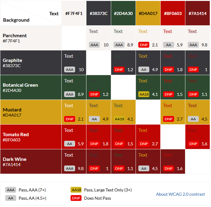
When picking brand colors, I always keep in mind how many combinations are available for various color schemes. While the Parchment foreground + Graphite background are the default, it's nice to play around with other color schemes in certain sections on a website. I always utilize tools like the Web AIM Contrast Checker or a contrast grid like the one below to check which color combinations follow the Web Content Accessibility Guidelines (WCAG).
For the ketchup and hot sauce bottles themselves, I built vector mockups in Figma. I'm not a Photoshop expert and there was no need to create real product labels or mockups; this case study is focused on brand identity and website development.
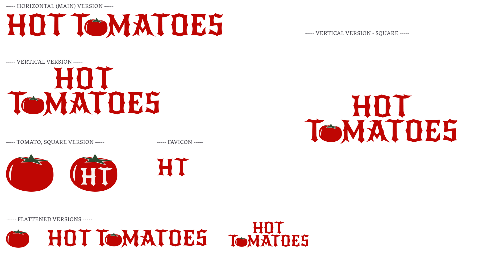
I decided to lean on the typography for the logo design, but replaced a letter O with a tomato, keeping it classic with a little twist. I created every variation needed: horizontal, vertical, square, icon versions, favicon, etc.
Creating the Products
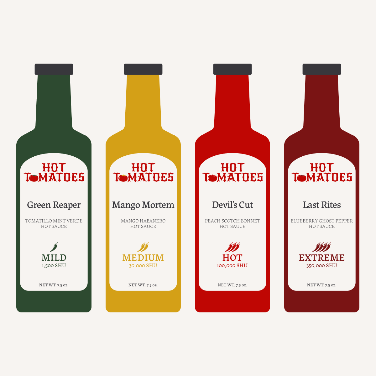
Once the color system was working, the product lineup mostly designed itself. I needed enough products to actually demonstrate the heat-tier system, so I created six in total:
- Two ketchups: The Founder (smoked tomato, mild) and The Reckoning (habanero tomato, hot). I needed at least a couple tomato-based products to tie back to the brand name.
- Four hot sauces: Green Reaper (tomatillo mint verde, mild), Mango Mortem (mango habanero, medium), Devil's Cut (peach scotch bonnet, hot), and Last Rites (blueberry ghost pepper, extreme). The names escalate with the heat.
- I also created bundles: The Mourning, The Inheritance, The Pantry, The Wake, and The Estate, to explore how collections render on a Shopify store.
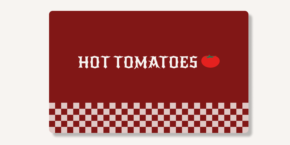
- And a gift card, because every store should have one!
Building a Shopify Store
Product Metadata
When adding products to the Shopify store, I created some custom metafields to enhance the site:
- Heat Level: includes a Name ("Mild", "Medium", "Hot", "Extreme"), a Scoville Heat Units (SHU) Measurement, and a Heat Integer (1-4). Each product references one heat tier, and from there the entire interface adapts: product cards display a heat badge, the product details page can display the SHU range, etc.
- Subtitle: short product descriptions (example: Mango Mortem's subtitle is Mango Habanero Hot Sauce). The product names are stylized and dramatic, so the subtitle tells you what the product actually is.
Theme Customization & Custom Code
I started with the Crave theme, and customized it through theme settings, custom Liquid sections, and direct edits to existing Liquid snippets. I used the Shopify theme editor for layout-level decisions and the Shopify CLI for code-level changes, with everything version-controlled in a GitHub repository. This setup gave me real development workflow tools (hot reload, syntax checking, version history) while keeping the theme editable by non-developers (if this were to be handed-off to a client).
Home Page Scrolling Animation
For the home page, I wanted to demonstrate the freshness of the products through visual storytelling within a scroll animation. We start with a few tomatoes on a vine. As you scroll down the page, the tomato falls off the vine, lands in a bottle, the bottle's color shifts from green to dark wine, and a thermometer within the bottle fills up to the top, joined by a "HOT!" sticker. There are two phrases placed at different stages within the animation: "From vine to bottle." to begin, and "Heat that packs a punch." at the end.
The home page scrolling animation on a desktop-sized screen.
To achieve this, I created a custom section within the project's code (sections/vine-to-bottle.liquid) and a JavaScript file to handle the animations (assets/vine-section.js). It utilizes position: sticky to pin elements within the viewport while the user scrolls through defined ranges. Each stage's scroll progress is calculated independently using getBoundingClientRect(), with sub-animations driven by a remap() function that translates the stage's 0-to-1 progress into specific sub-ranges. This allows elements to transform at different overlapping points.
The assets (tomato+vine, bottle, thermometer, and hot sticker) are all SVG elements, which makes them easy to transform and animate. To cleanly separate the tomato from the vine without using image replacement or another technique that might glitch or skip, the tomato path is singled out into a group using the <g> tag, and given an ID of detachable-tomato. This results in a seamless transition from attached to detached. Additionally, the original thermometer SVG file includes a thermometer that is fully filled to the top. After bringing the SVG element into the code, I was able to narrow down the part for the thermometer fill, and give that an ID of its own (thermometer-fill). To fill the thermometer as this user scrolls, I applied the CSS rule transform-origin: center bottom, and mapped the scaleY property from 0 to 1 over the height of the viewport.
1 2 3 4 5<svg class="thermometer-shape" width="76" height="443" viewBox="0 0 76 443" fill="none" xmlns="http://www.w3.org/2000/svg"> <path d="M37.9889 0C51.5249 0 62.4979 10.973 62.4979 24.509V376.525C70.7426 383.437 75.9779 393.771 75.9779 405.317C75.9779 426.129 58.9696 443 37.9889 443C17.0082 443 0 426.129 0 405.317C0 393.771 5.23529 383.437 13.4799 376.525V24.509C13.4799 10.973 24.453 0 37.9889 0Z" fill="#F7F4F1" /> <circle cx="37.9893" cy="405.622" r="25.7344" fill="#BF0603" /> <rect class="thermometer-fill" x="26" y="30" width="24" height="366" fill="#BF0603" /> </svg>
This animation required no third-party animation libraries. It runs on requestAnimationFrame with a ticking flag to prevent multiple frames from being queued per scroll event.
Accessibility
- Color contrast that follows WCAG guidelines.
- Color choices were made with WCAG-AA contrast requirements in mind (see the color system section above).
- Reduced motion still yields a complete experience.
- The scrolling animation section respects
prefers-reduced-motion: reduceat both the CSS and JavaScript levels. CSS provides static fallback positions for the animated components; JavaScript checkswindow.matchMedia()and exits its animation logic early if the preference is set. In the static fallback positions, every element is in its final state, which prevents a half-finished scene. This ensures that reduced-motion visitors still see the complete visual narrative, and only motion is removed.
- The scrolling animation section respects
Responsive Design
Most people browse the web on their phones now (even though I don't really want to admit that...just let me design for big screens, please!). Anyways, everything had to not just work on mobile but be an equal experience to the browser. Standard responsive practices do most of the work here: flexible grid layouts, scalable typography (clamp() and viewport-relative units), and media queries.
The scroll animation section was a little tricky to get right, but the main solve was to structure elements so they're positioned relative to each other rather than relative to the viewport. This is how I maintained the position of the thermometer within the bottle, no matter the screen size.
Asset Credits
- Home Page Hero Banner (peppers): Photo by Marcos Paulo Prado on Unsplash.
- Tomatoes Vine silhouette: Vector art by Md Jakir Hossain on Vecteezy.
Thanks for reading!
While Hot Tomatoes is a fictional brand, the work was real! If you've got a similar project in mind (branding, e-commerce storefront, custom frontend development), get in touch.